Categories
Design

Email Marketing Design Trends to Help Reach a Larger Audience

Email marketing is one of the most effective ways to communicate with your audiences. It’s important that your email stands out to your subscribers and speaks a clear and interesting message. An effective design can grab the attention of your reader and increases the chance for them to read your content.

Intelligent Design

Intelligent design within emails refers to the combination of design with technology.  This allows your subscribers to interact within their emails. Creating embedded surveys within an email allows readers to interact within their inbox, without getting redirect to another page.

Typography

Integrating creative and original typography into your email will help it to stand out. Using different fonts will also bring different parts of the email to life. Branding ideas use different typography to highlight certain offers within an email to capture the reader’s attention and lead them to make a purchase.

Videos

Based on a recent study, embedding videos in an email is the latest trend that has proved to increase the email open rate by 19% and the click-through rate by more than 50%. Also, including video content within an email is an interesting way to communicate your message to the reader. Videos grab the attention of the audience while also easily getting your point across. Viewers are more drawn to video content rather than reading through text. A video clip also saves time for the reader and the sender by explaining a concept or product in a quick and interesting way. Including videos in emails is an effective marketing trend that has proven success.

AMP Powered Emails

AMP (Accelerated Mobile Pages) allows the viewer to stay within an email rather than being redirected to a new web page. Last year, Gmail (Source) announced the addition of interactive emails powered by AMP. AMP powered emails allow information to be updated in real-time, which means that an email can always stay up to date with its content. This is a valuable marketing trend that will drastically change email effectiveness.

Visuals

Visuals have gone to the next level. The new trend is creating 3D images. Using tools such as Adobe Dimensions CC helps designers to create innovate images with a realistic look. This content wows the reader and brings a who new design perspective to the email that your subscribers will love. 


Categories
Design

Here’s What You Need to Know about Typography

Top 10 Typography Trends You Don’t Want to Miss in 2018


Font vs. Typeface:


The choice you make for your brand’s font is an important one because the right one conveys so much about your brand. So, when choosing your font it’s a good idea to know what you’re actually looking for, which is typefaces. You may see the terms “font” and “typeface” used interchangeably, but they refer to separate facets of text display.


“A typeface is a set of one or more fonts each composed of glyphs that share common design features.”Like people, typefaces have personalities and moods. It’s the design we often call today “font” such as Arial, New York Times, or Courier. But the font incorporates the typeface plus the attributes, such as the style (bold, Italic, etc). No typeface is equally created, they come in all shapes and sizes, and each one has its own style and characteristic, just like your brand.


2017 top favorite fonts:


  1. Helvetica
  2. Arial
  3. Georgia
  4. Gotham
  5. Myriad Pro
  6. Corbel

2018 trends from Marketprofs:


  • Serifs will dominate
  • Retro Makes a comeback
  • Bigger is better
  • Cutouts and Overlays
  • Highlights and underline
  • Hand drawn letters
  • Gradients will take over
  • Custom fonts will emerge
  • Colorful fonts will be the new black
  • Transparency in typography


How to select the right font for your brand


1. Match font with your brand’s tone.

First,  select a font that matches your brand’s identity.

2. Use Hierarchy.

After selecting the fonts placement, rank each font by importance. It’s suggested to never use more than three fonts because it’s messy and inconsistent. 

3. Know the basics of primary font types.

Serif

A “serif” is a small line (sometimes called feet) at the end of each stroke in a letter or symbol. It’s often present in print (books, newspapers, etc.). Sans Serif fonts create a classical and elegant appeal and talks to older audiences.

Popular serif fonts: Times New Roman, Georgia.

Sans serif

Sans serif fonts don’t include lines or embellishments at the end of a stroke. It commonly appears on computer screens and smartphones. Therefore it’s appealing to the younger generation.

Popular sans serif fonts: Helvetica, Arial, Futura.

Script

A highly decorative and elegant font is known as script fonts, with plenty of embellishment and stroke flourishes, and the letters connect. It’s popular in the feminine market.

Popular script fonts: Lobster, Reklame Script.

Handwriting

A casual and personal approach is transpired from handwritten fonts. It’s preferred by businesses who want their brand image to be relatable and approachable.

Examples: Bradley hand, Kristen, and MV Boli.

4. Master mixing fonts.

Try to select versatile typefaces which change smoothly yet noticeably to differentiate between functions within your design.

5. Preview overall design.

See how the font looks within the overall design. The goal is to remain consistent with the template. 


Comment your favorite fonts!


Categories
Design

Q & A: Justin Aragon, Creative Director at Spectruss

Ten questions with Justin Aragon, Creative Director here at Spectruss


Tell us how your background in architecture has shaped your career?

“Architecture is built for permanence. My architectural training and knowledge of the classics have helped me identify and incorporate the qualities of timeless design to every project. Staying relevant over time is very important to me.”

How does working at Spectruss excite you?

“Working with an enthusiastic team, great clients, unique projects and leading the creative side of the business excites me every morning!”

In your opinion, what differentiates Spectruss?

“People usually come up to me and say… “I can tell when you guys did it.” We’ve built a more modern identity that separates us from others.”  

Describe your creative process.

“Developing a strong concept and letting that blossom effortlessly.”

During the creative process, what should others keep in mind?

“Step 1: Question everything. Step 2: Have an answer. Step 3: Slay.”

What does strategic design mean to you?

“Flawlessness. In reference to the previous question: If you have an answer or a reason for every design decision then you’ve developed a superb strategy!”

Can you give us a tip for success?

“Show… Don’t Tell.”

Do you have any inspirations?

Less is More – Mies Van Der Rohe”

Are you seeing any trends?

“I only like trends that have an ability to become a classic. But I always feel like the trendy thing to do is to not be trendy.”

Any advice?

“Give white space a chance!”


Categories
Design

Learning to Code is the New Requirement for Jobs in Design

Designers who can create beautiful and trending concepts are in high demand. Their skills can take an amazing product and make it understandable and desirable to customers. But a new wave of designers and developers have started to change jobs in design. Designers are learning to code, and developers are learning to design.

Design + Coding

Companies have started looking for designers who can also code. They want people who can come up with a concept, and be able to execute it too. People who can fill these roles are becoming highly desirable. Learning HTML, CSS, and/or JavaScript is showing to have its advantages by giving designers a better understanding of their limitations and where you can push bolder concepts. These concepts were often needed to be relayed by developers, but if a designer is already aware, time lost on project iterations may be eradicated.

With this information, designers have begun to take charge. New workshops are opening up for designers who want to learn to code. (https://generalassemb.ly/education/coding-for-designers/san-francisco) This workshop linked takes place in San Fransisco and helps get one ready for transitioning into three types of coding. These skills can also be transferred into jobs in the web development field and UX careers.


Recently, at SXSW in March 2017, John Maeda delivered a “Design in Tech Report” where he explored new trends on jobs in design and coding that you can watch here, https://vimeo.com/208035080


Coding is something worth considering for designers in the tech field. Developers are quickly becoming more style savvy and integrated into design meetings. While technical skills are a great addition to any resume, they may just be the next thing that gets you hired in the tech designer industry.

Categories
Design

Passageways Sketch

We’re very excited to see Passageways all over the press! To get our creative juices flowing this week, we worked on a quick sketch to visualize how these alleyways can be utilized to create a new network of spaces within the urban fabric changing the way we circulate around our city. It’s been a pleasure working and partnering up with  AIA Tennessee and River City Company on this community outreach project and we can’t wait to see what the participants have in store for the opening! Get more information at http://passagewayschattanooga.com/

Categories
Design

Spectruss Lead Designer Justin Aragon Interview

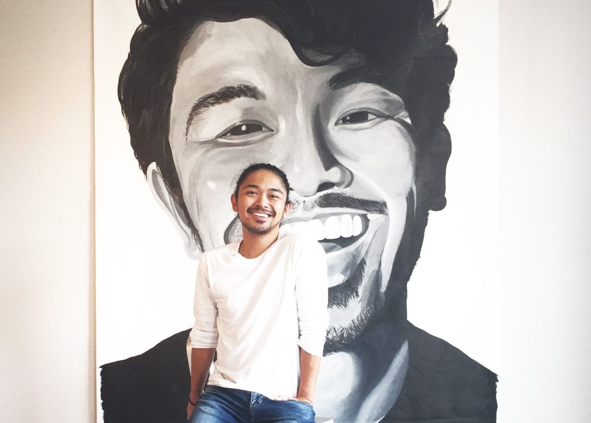
This week we highlight lead designer of Spectruss, Justin Aragon. In this interview, we learn about his design aesthetic to his personal web design treasures!


What is your greatest strength when it comes to designing website layouts?

When it comes to designing website layouts, you have to think of who you’re designing it for first. Listening to the client’s vision is a major strength to have and being able to translate an abstract idea to visual communication. Every web design project we work on is custom designed for each client. From the navigation, sizing, text placement, typography, photography, video, film, graphic elements, animations… etc., everything is designed accordingly to best represent who the client is. It is also important for me as a designer to produce unique designs every time. It keeps me creative, playful, push envelopes and maybe raise some eyebrows too!


Do you create all the components to the website? (icons, imagery, art)

Yes! I’m very observant… which every designer should be. I look at websites every day. My eyes recognize when certain graphic elements or iconography have been used before in multiple projects by different agencies. Even when I’m driving around the city, it frustrates me when I see the same topography and icons on billboards and posters here in Chattanooga. I like to give our clients designs that they can only call their own. I have Illustrator files that scroll forever full of custom-designed graphics that I consider one of my prized possessions.


When working on a project, what is your average turnaround for completion?

Every project has a different timeline, so it’s difficult to give a specific number. It also varies on what kind of project it is. We’ve worked long term with clients on fully functioning custom-designed websites, to as short as two weeks, to twenty-four hours! The average would probably be around three to four weeks. Ideally, we like to have a week for the design phase, another week for edits, and go to the programming phase on the final week.


What part does branding and brand identity play in your creative process?

Branding is everything! Branding dictates the overall direction of how to represent your clients. Branding a new company is probably the most creative part of being in this business. We’ve worked with several local clients here in Chattanooga, and it feels really great when people recognize your work just by looking at a signage, logo, and visiting a website. When I moved back to Chattanooga from Architecture School in 2011, there was a growing population in the creative community… which was awesome! But I also noticed that everyone was producing very similar trendy designs. Trends can only last until there is a new one. I’m a huge fan of timeless design that remain significant over years and years. I always keep in mind when designing a logo or any kind of branding that the overall visual appeal would become an instant classic and does not come with an expiration date.


Do you favor the idea of working with a company to focus their branding and improve upon it before beginning the website process?

When clients come to us, they are either looking to start from the beginning or unhappy with their current appeal. It is always good to suggest improving certain elements of their brand before further producing major work. When we work with a company that already has their branding established, it is our job to use what they currently have and build the rest of their Identity effectively. Limits can be great. It can be your friend sometimes. When I was studying architecture, I hated working around building codes, but you’ll realize how efficient your designs become. It’s the same with any type of design. You have to be able to work within certain parameters.


How would you best describe your design style? (modern, vintage, etc.)

Like I hate labeling my relationships, I don’t necessarily put a stamp on my forehead and say I only have one specific style. I guess I can answer the question in two parts:

Being in the creative industry, you have to be able to tackle different styles. For web design, it is always important to be cutting edge. Since websites are now the new storefronts, you always want your appeal to be fresh and interesting regardless of style, because you are one click away from the x button. If “Advanced” is a style, I would say as a company that we integrate design with the most current technology in our work.

In my personal time, I still do a lot of designing. I’ve been working on conceptual furniture, playing around with new silhouettes for men’s fashion, and currently building ideas for the Millennial House. I could describe my personal aesthetic as modern minimal. I like simple bold statements, solid contrasting gray tones, and honesty of materiality. When you’ve been working all day with information overload on client projects, it’s nice to come home to clean lines, smooth surfaces and pure simplicity because it will always be beautiful. A very small hint of my personal style can be seen in my professional work, but I always make sure that the work remains egoless and not about me.


Categories
Design

Is there a deeper meaning to your doodle?

Let’s be honest with each other, we all doodle. (Yes, even drawing a circle over and over again on a piece of paper in a meeting is an act of ‘doodling’).

Often-times, doodles originate out of sheer boredom. We may be in a slow meeting, trying to recalculate our day, or trying to remember what we have forgotten. What if your doodle had a deeper meaning?

Doodling is actually a very helpful way to let a stream of consciousness flow, it’s kind of like unplugging a drain in your bath tub, allowing all of the stored up thoughts and ideas spill from your pen onto the paper. From geometric shapes inferring inherent and established order in your thinking to small scribbles in a pattern can hint towards an inner desire for structure, all parts of your doodle could mean a little more than you think.

When you get the chance, save a doodle or two that you may have done during a meeting or conversation with a coworker and go back and evaluate the sketch. What did it hint towards how you were feeling? Was it accurate? Who knows!

We all know physical expressions can tell emotions, but what if your little doodles told you just as much about yourself, if not more, than that Facebook status you just posted?

See the full analysis of your doodles here – http://doodle-day.epilepsy.org.uk/doodle-meanings